UI Design Studies
UI Grams
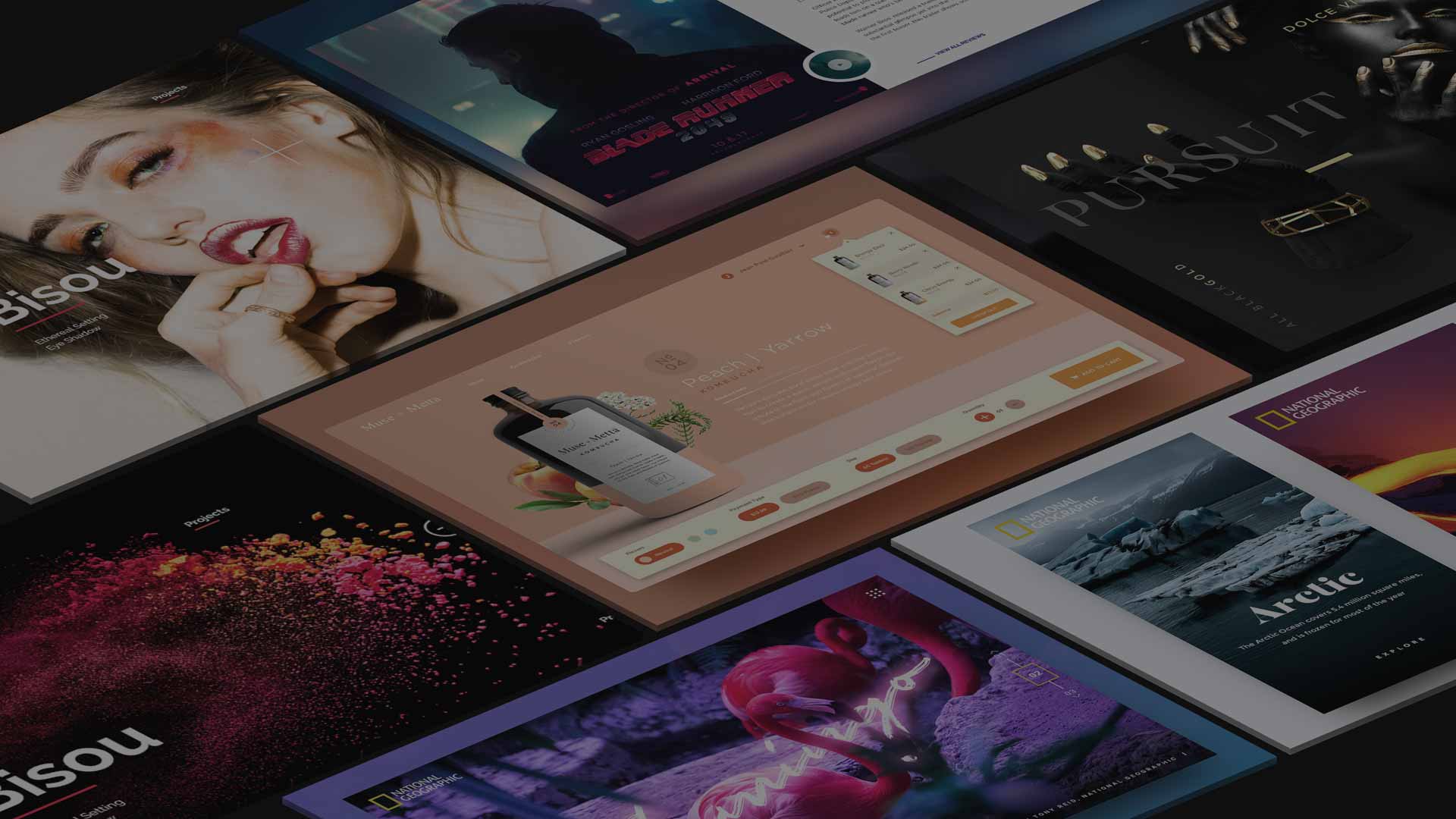
Take a UI/Web design and then remake it using a different subject matter for design practice and learning.
Scroll
01
Intro
overview
Design practice using my favorite designs I find in order to gain new perspective on why I gravitate towards some designs and not others.
Role
Designer
Platform
Instagram
Project
UI Design
What makes a design good? appealing? What makes a design look complete? What makes it difficult? challenging? So many questions that I need answered. And they keep on comin'.
Challenge
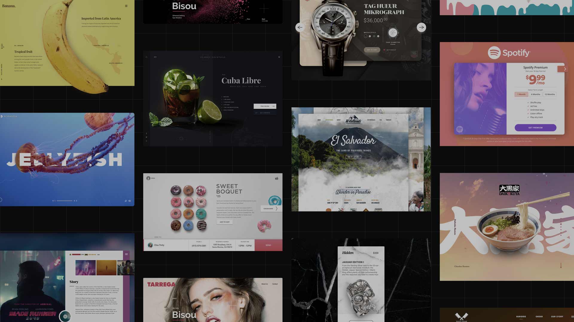
My goal is to create 100 of these small designs. Designs that range in different subject matters: hero banners, dashboards, app designs, designs that really catch my interest.
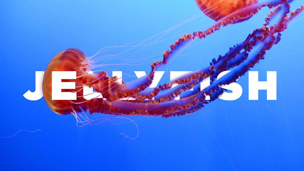
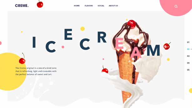
Hero Banner
You can never can go wrong with great type design or beautiful photography in this category.
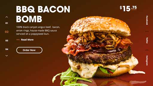
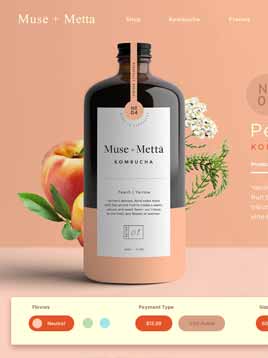
Analytics
I find analytics dashboard's much harder to execute. They are not as appealing as large photography, but I enjoy the complexity and difficulty of it.
These mini-designs are are solely made for the medium of Instagram. It alters the nature of the design knowing I'm constrained to a small viewport.
Quick
The idea is to execute these as quickly as possible. My goal being able to execute them in a day's time.
02
Strategy
Love Hate
I think some of the designs are garbage relative to others, but I try not to get caught up in worrying about the perfection of them. For this exercise, quantity > quality. These have worked great for my mental fortitude in some strange way that I wasn’t expecting. I was able to “let go” of feeling so vulnerable when showing work and being open to all the good and the bad. Specifically the bad, which I was afraid of before.
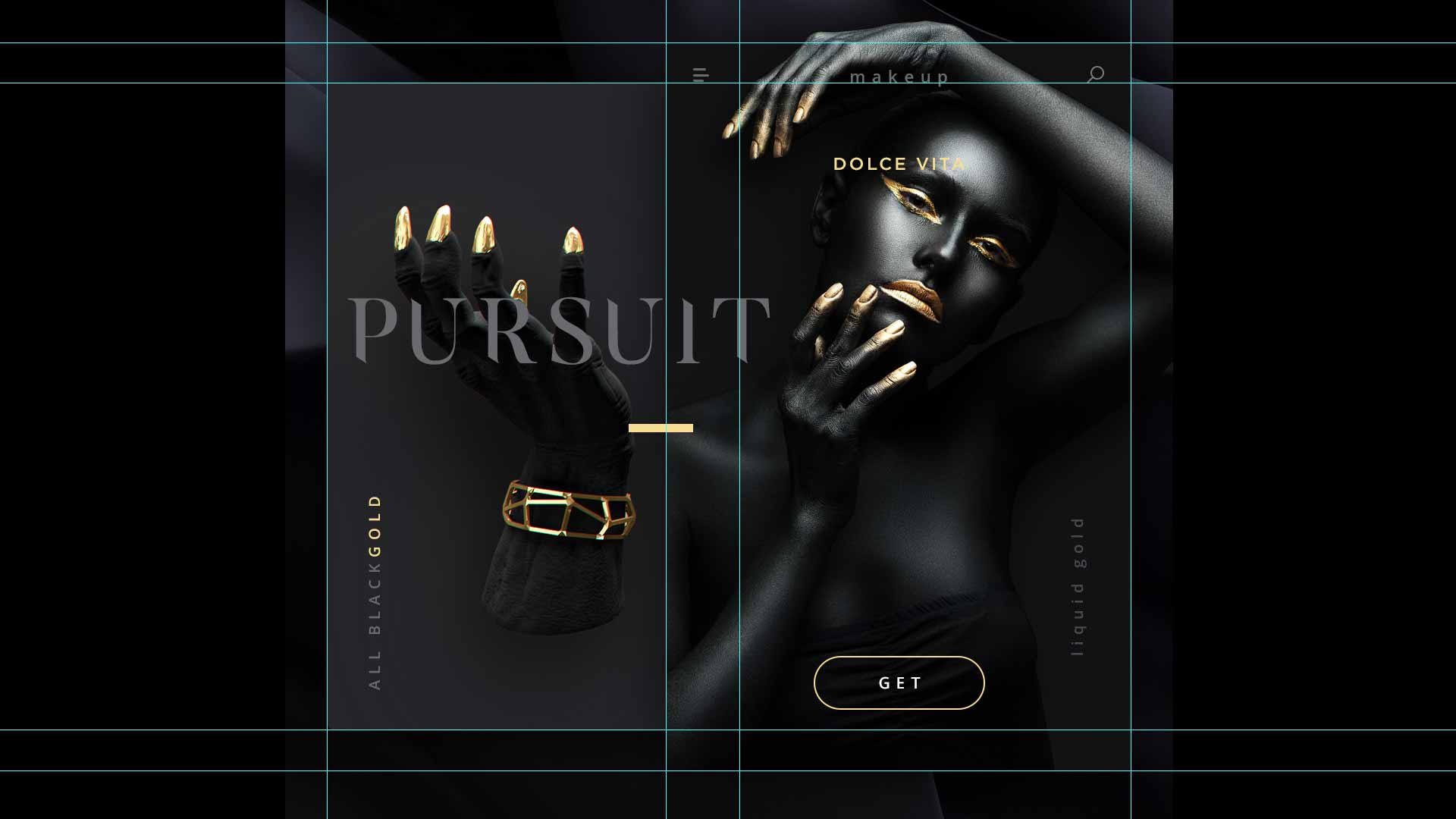
I find working on these designs very meditative and relaxing, especially after a stretch of programming.
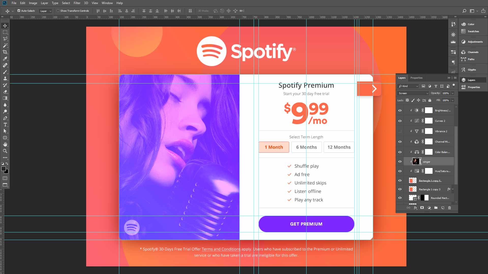
There’s an added layer of thought when creating these. What works in the IG frame doesn't necessarily mean it will work on a site. How will the color show? the texture? is it clearly viewable? And how will they show in the grid view next to the other uploads?
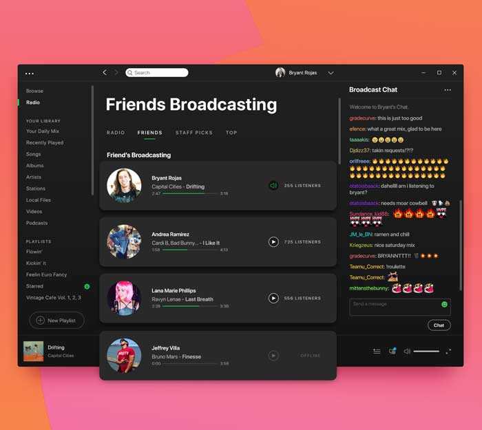
about
I knew going in that this design wouldn't get much attention on Instagram, because it's not as visual as some other designs. However, I did this one because I knew it would be challenging. It's a new type of functionality that would allow users to host a radio station and they can DJ their own playlist. And users would have the ability to listen in on what their friends are playing.
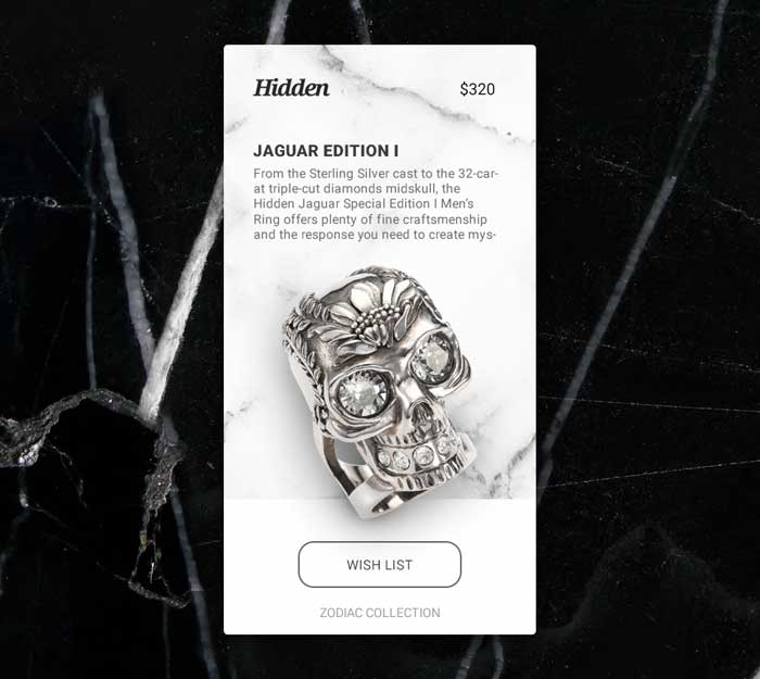
about
I wanted to create a design/brand that was luxurious. I wanted the color of luxury, black, to be the dominant color. And I combined that with marble texture for extra opulence. At this point, the subject matter can range: wine, whiskey, cat, dog, frying pan. I went for low hanging fruit going with a ring encrusted with diamonds. Ha, too easy.
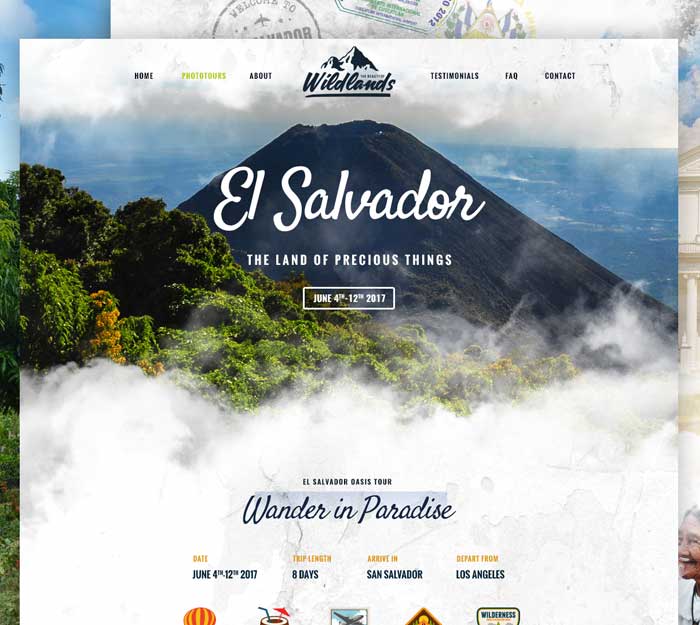
about
It almost looks like an actual travel website. Well that was the intention at least. I chose El Salvador because my parents are from there. The page in the back actually has nothing on it. This is where I learned that having all the "standard" elements can create the perception of professionalism.
special thanks
Inspiration
BASIC BB Dakota
BASIC Beats by Dre
SuperCrowds Agency Website
Maria Callas Personal Website
Steve Mengin Portfolio Website
Samsy Ninja WebGL Website
Ben Mingo Creative Website
Hands Agency Website
MindCastle Studio Website
RESN Agency Website
Bruno Quintela WebGL Website
Vaalentin WebGL Website
Big Horror Athens Studio Website
red collar Agency Website
Gucci Gift 2017
Kuon Yagi Design Website
Yara Lapidus Experience Website
Andre Ribeiro Creative Website
Reed.be Studio Website
Jenny Johannesson Portfolio Website
Leviev Group Studio Website
Nadine Schneuwly Creative Website
Mr Doob ThreeJS
Active Theory Studio Website
